Previously we ran through how the Oncrawl API can be used to scale your SEO data science with Python code. If you followed the steps, you’re now ready for SEO science.
With the data in place, we can now start the journey of examining the technical SEO data and ultimately generate more creative, yet precise, technical recommendations that will make your website content more discoverable and meaningful to search engines.
Not only will your recommendations be more effective, you’ll find that when it comes to securing buy-in from decision makers and web developer colleagues (who are likely to be very science minded), providing data will make it that much easier while improving your credibility as an SEO professional.
The steps we’ll run through are virtually the same ones as those taught on data science courses such as Udacity and Datacamp, except we’re SEO consultants so we’ll skip the questions that pure data scientists might ask when examining crawl data for the first time.
The steps are:
- Univariate analysis
- Segmenting URLs
- Bivariate analysis
Univariate analysis
When practicing data science, the first thing a data scientist does is examine the data, known in the trade as Exploratory Data Analysis (EDA). Ultimately, data scientists are looking for features (read ranking factors) to feed into a model to help them:
- Understand how something (a process) works
- Make forecasts and predictions
To do this, they examine the data, mainly for the distribution of a ranking factor: this tells us whether the data is skewed and requires normalization, the most common value (i.e. centrality, the average).
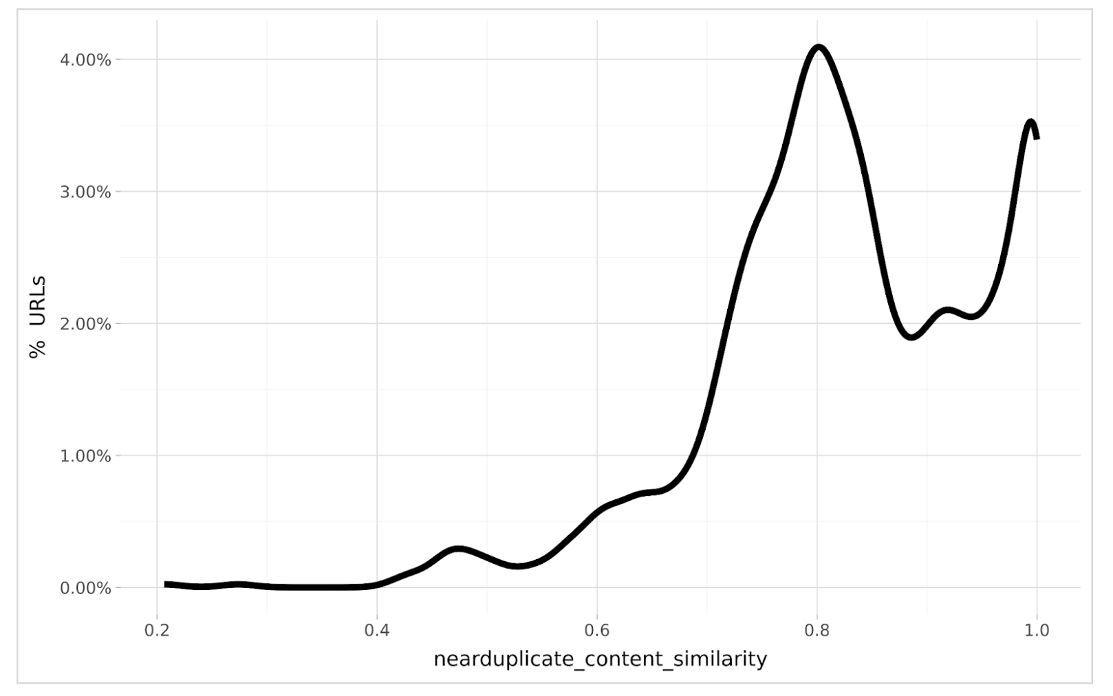
Let’s take a look at some distributions. The chart below shows the distribution of URLs with near duplicate content i.e. the volume of URLs for different levels of duplication.
What can we see? Most of the URLs are 80% similar as shown by the peak which is just above 4% of the site total. There is another peak at 99% similarity. In statistics, or data science language, we’d call this distribution multi-modal as there are two popular values of duplicate content similarity scores.
We can also see that the distribution is negatively skewed as the peaks are right of the center, so most extreme values are to the left i.e. unique content is more rare than common.
This visual analysis should be performed for all technical SEO issues of concern because it tells us what is ‘normal’ for the website we’re auditing.
[Ebook] Data SEO: The Next Big Adventure
Segmenting URLs
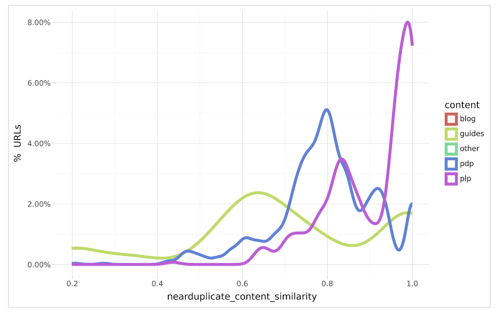
While the overall distribution is useful, even more useful is to segment the URLs by content type. For example, product categories, blogs, pages and product items if your audit site is e-commerce. You may choose other segmentations such as subdirectories if it helps you or your colleagues understand them better. The chart below shows a segmented distribution of near duplicate content.
The segmentation is a bit more revealing as we can see that most of the duplication is in Product Detail Pages (PDPs aka product item pages) and Product List Pages (PLPs aka product listing pages).
The segmentation also reveals the reason for the multi-modality of the overall distribution as the PDPs are 80% duplicate while PLPs are mostly 98% duplicate. This intuitively will give us templates to focus on redesigning and engineering to reduce the duplication for both content types.
We can also see that blog content doesn’t make the plot which implies no persistent duplication exists in that content type.
With guides, there is mostly 65% duplication however thanks to the segmented analysis, we’re able to prioritize which content duplication should be resolved first.
Bivariate analysis
Naturally, the next question quite predictably arises, what is the performance offered from resolving duplicate content i.e. why should the organization dedicate design and/or developer resources to fix it?
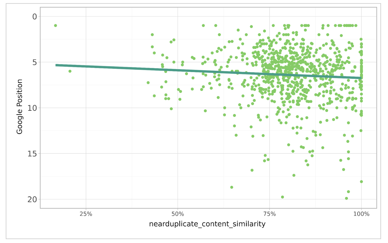
I suggest using a correlation plot, of which the example below shows the correlation between Google Rank (sourced from Google Search Console also available from Oncrawl) and duplicate content similarity.
The correlation is positive as we can see the reduction in duplication leads to a higher rank position in Google. While the correlation is not the strongest, it’s still very good considering the hundreds of other ranking factors Google takes into account.
With some statistical modeling, the beta coefficient would reveal the amount of Google Rank position improvement available for every 1% decrease in near duplicate content similarity.
Conclusion
So far we’ve seen that taking a statistical approach to SEO technical data can tell us a lot more about the nature of a website’s feature than just relying on their averages. It tells where most of the data is and how prevalent the technical feature is.
Segmenting the data gives us even more insight to see what content is most impacted by which technical feature and accelerates our focus on getting this resolved.
If we use regression analysis to correlate the technical feature to rank performance, we can more easily communicate the fact that the technical feature is in fact an issue, and indicate the benefit of getting it resolved.
However, keep in mind that not all technical factors can be resolved by examining audit data from a single site. For example, the number of text to code ratio is likely to be similar across all content on a client site. Alone, this information can be difficult to understand, so a bit of context is required by comparing it to competitors, which will be covered in part 3.


