The ultimate goal of SEO is to ensure that your target audience can effortlessly discover your website. But that is of no use if users cannot access your website.
The truth is that both discoverability and web accessibility go hand in hand. You can only reap the maximum benefits if your website is both easy to discover and easily accessible by your target audience (including people with disabilities).
In this post, we will talk about:
- What is web accessibility?
- Why is it important?
- How can web accessibility help in SEO?
- How can you make your website easily accessible for all users?
First, let’s understand:
What is web accessibility?
Web accessibility is an initiative by World Wide Web Consortium (W3C) that aims to make websites accessible and usable for everyone. It means users can easily perceive, understand, navigate, and interact with your website – even if some of them are disabled and cannot access the Internet like regular users.
Web accessibility includes people living with all types of disabilities that affect their access to the web, such as physical, visual, auditory, cognitive, speech, and neurological disabilities.
Regular users can also advantage a lot from Web Accessibility. Here is how:
- We can use voice search and screen readers if we are occupied in something critical and cannot use our hands for navigation.
- Old users who are losing their abilities can use web accessibility for a better web surfing experience.
- People with temporary disabilities like an injured arm or lost glasses can also make use of the web accessibility feature.
- You can also use web accessibility to surf the web in situations like bright sunlight and an environment where they cannot listen to the audio.
- People with slow internet connection or expensive bandwidth can use web accessibility to access websites without any hassle.
This 7-minute long video by the W3C Web Accessibility initiative explains web accessibility and its importance in detail:
Why is web accessibility important?
There are millions of people around the globe (61 Million in America alone) living with some physical disability, and half of them are regular Internet users.
It means there are chances that some people in your target audience can be visually/physically impaired and cannot access the web like regular users.
For example, a blind person cannot see your website. Instead, he/she has to rely on a screen reader to grasp the information your website has to offer.
A person with dyslexia cannot read regular fonts. Instead, he/she will see the website screen:
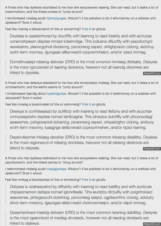
Similarly, a person who is physically impaired cannot use the mouse or keyboard, a person with auditory impairment cannot hear audio, and someone with disorders like ADHD cannot focus on a website for long.
Now, if your website is not easily accessible for these people:
- You will miss out on a large fraction of your potential website visitors.
- You will open doors for costly lawsuits as these users can sue you under the Section 508 legislation of the Americans with Disabilities Act (ADA).
- Poor web accessibility also leads to a poor user experience, which is a crucial factor if you want your website to appear in top search rankings.
So, the stakes are high. Neither can you risk losing millions of potential website visitors, nor can you afford to involve yourself in costly lawsuits. That is why web accessibility is critical.
How Web Accessibility Matters in SEO?
One common notion is that SEO and web accessibility cannot work together. Achieving SEO goals will be impossible if we play by the accessibility guidelines.
But with time, we have realized that this is not entirely true. There are many areas SEO and web accessibility intersect. By improving the accessibility of a website, you can also enhance its SEO.
Here are eight ways SEO and web accessibility work together:
1. An accessible design also improves the user experience
Most of the practices for building accessible website designs are the ones that also enhance a website’s user experience.
For example:
- Legible text not only makes websites look appealing for visitors but also ensures people with visual impairments have no problem in accessing it.
- Straightforward navigation not only results in a better visitor experience but also proves helpful for people with cognitive impairments or users who are navigating your website with a keyboard.
- Quick load times help both people with disabilities or users having a poor Internet connection.
- Navigating through a website can be frustrating for both regular and disabled users if the links in the website are broken or missing.
All these little things also play a crucial role in SEO. They result in a better user experience, which is a crucial ranking factor. Google has made it clear in its guidelines that websites with better user experience will have a higher priority in search engine pages (SERPs). They even have a 160-page long PDF document that talks about user experience and its role in SEO.
So, an accessible web design will also enhance your website’s SEO.
2. Accurate Page Titles Help both Screen Readers and Searchers
Another important factor for designing an accessible website is to use page titles on each webpage so that users with impairment can understand what it is all about.
Using accurate page titles that reflect the content of your webpage is essential, especially for visually impaired users, because page title is the first element that a screen reader will read. It sets expectations for these users on what information they are going to consume. Doing so also helps them differentiate content when multiple webpages are open.
The page title is also crucial for SEO. Google makes it clear that your content should match the user’s intent. To rank higher in search engine pages, you must use page titles for each web page accurately.
So, using an accurate title that reflects what your webpage has to offer is a win-win. On the hand, by using deceptive page titles, you will lose a lot.
3. Good Header Structure Lays the Foundation of Clear Content Hierarchy
Header tags are responsible for defining the hierarchical structure of a web page. Not only do they make the web page content appear visually appealing, but also help people with visual impairments in navigation through the information in a better way.
Following are the accessibility guidelines we follow while using headings:
- Follow a logical sequence
- Do not skip sections (H4 should not come directly after H2)
- Heading should describe the content
The following image describes a good and bad header structure:
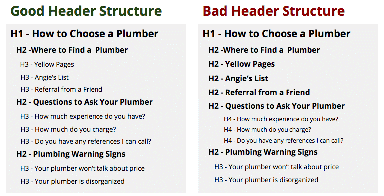
If the header structure is clear, cognitively impaired users can decide which sections they should read and which they should skip. Moreover, visually impaired people need a well-defined header structure for a smooth website experience.
From the SEO point of view, headers can help you break your webpage into logical chunks so that you can create content that matches the intent of your target audience. Apart from this, a good header structure can also help you win feature snippets.
So, using a well-defined header structure can prove helpful in terms of both SEO and web accessibility.
4. Descriptive Alt Text Provides Right Context to Both Disabled Users and Search Engines
Web accessibility guidelines also suggest using descriptive alt text in all web page images. It helps even visually impaired users understand what the image is all about (screen readers read the alt text aloud, thus providing the context about images to users).
Even in situations when the image is not loading due to a slow internet connection, descriptive alt text can prove a lot helpful. Users can understand everything about the image just by looking at its alt text.
Descriptive Alt text also helps search engines understand the subject matter of images and crawl them, which can ultimately improve your website’s SEO.
So, using the right alt text will not only help disabled users in understanding your website’s content better but will also boost your website’s search rankings.
5. Anchor text improves page relevance and sets user expectations
Another web accessibility factor is anchor text, which ensures the link is presented to users with relevance and accuracy so that users can smoothly navigate.
Impaired users who are navigating with the help of a keyboard or a screen reader browse the web by skipping from link to link. Using a quality anchor text will ensure that these users know where each link is pointing so that they can choose the one that serves their purpose.
Google also considers anchor text as a critical ranking factor that informs the search engine about the website content on which you are pointing your visitors.
So, the right anchor text can help you with both accessibility and SEO purposes.
6. Video transcriptions also help in video indexing
Web accessibility guidelines also make it mandatory for website owners to provide transcriptions (text-based description) for all the videos on your website so that even people with blindness and deafness can access them.
Doing so also makes videos accessible for:
- People who are prone to seizures triggered by flashing images
- People who have a slow Wi-Fi or cellular connection
- People who are traveling in a crowdy place and don’t have earphones
Transcriptions also help search engines understand your video content and crawl it higher in search rankings.
7. Sitemaps help both users and search engine crawlers in smooth navigation
Sitemaps not only help users with visual impairments smoothly navigate through the website by giving them a big-picture overview of the entire content, but they also help search engines find and index all the pages.
Sitemaps are especially helpful in websites that have a complex design because, in that case, search engines might miss or ignore some webpages. Also, navigating through a complex website without a sitemap will be a nightmare for visually impaired users.
Overall, improving your website for accessibility will also improve its SEO. Serving the needs of your visitors will also serve the search engine requirements.
How to know whether your website is accessible by all people?
You can easily check your website’s accessibility with the help of tools/chrome extensions. Many of them are available in the market. Here are the ones I find useful:
1. Google Lighthouse
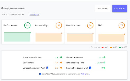
Google Lighthouse provides a detailed accessibility audit of a website. It lists down all the issues that are preventing it from becoming fully-accessible and awards a score based on that.
Here is how the scoring screen will look like in Google Lighthouse:
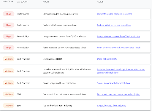
With each accessibility audit, you will also receive suggestions on how you can improve the accessibility score of your website:
2. aCe
Powered by accessiBe, a key leading player in the web accessibility market, aCe is an ADA Compliance tool that you can use to test your website’s accessibility.
The best thing about aCe is that it is highly fast. Within just a few seconds, it can give you accurate insights of your website. No wonder popular market leaders are trusting it to check whether their website is accessible or not.
The following screen will appear when you will test your website’s accessibility on it:
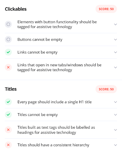
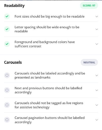
By applying the relevant fixes on these issues, you can improve your website’s accessibility.
3. A crawler
You can launch a crawl to find broken links and you will get the number and status of errors you have on your website.

You can make the necessary modifications and improve your website’s accessibility.
4. axe Web Accessibility Testing
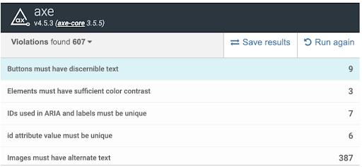
Axe Web Accessibility tool uses axe open-source JavaScript library to identify accessibility defects on a webpage. One thing that makes axe Web Accessibility an excellent choice is its simple user interface. You can easily view all the issues along with the locations where they were found.
5. Siteimprove Accessibility Checker
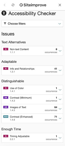
Siteimprove Accessibility Checker also offers a clear overview of web accessibility issues along with explanations on how they can affect readers and suggestions on how you can improve the accessibility.
Step-by-step checklist to ensure your website is easily accessible to everyone
1. Use of Color
- Never use the light grey color for text.
- Use a contrasting color for both text and button background.
- Make sure you are keeping the contrast between the background and the text color as 4.5:1 (for small text) or 3:1 (for large text).
2. Links
- Users must be able to differentiate between links and the surrounding link text visually.
- Avoid using words like click here. Link text must define the purpose of the link.
- You must provide skip links to keyboard users so that they can directly navigate to the main content.
You can also refer to this post for Powerful Link Building Techniques
Note: Links have the power to make or break the authority of your website. So, it is important to use them wisely. Better if you recruit link building experts or hire a link building agency instead of running experiments on your own. Doing so will make sure you do not make any mistakes during the link building process.
3. Screen Reader Reminders
- The context of all the links should make sense so that users don’t get confused.
- Use buttons to activate forms on screen readers.
- Provide skip links, which the screen reader users will use to jump directly to the main content.
4. Content Structure & Semantics
- Use a title for every web page.
- Always keep the first heading as H1.
- Always maintain hierarchy while using headings.
- Always choose a text size that is readable and easy to see. Regular size must be 14-16px whole navigation link text must be 16-18px.
- Ensure that your content is left-aligned except headings and subheadings (which can be either centered or left-aligned). It is helpful for people who are suffering from dyslexia as well as regular users’ comfort as they read from left to right.
- Always keep breadcrumb navigation left-aligned.
- You must provide disabled readers the facility of magnifying fonts on your website.
5. Images & Media
- Using Alt text for all images is mandatory.
- Make sure image links describe the link destination. Doing so is crucial for people who use the screen reader for navigation.
- Warn users when a link takes them off-site (applicable for both regular and visually impaired users).
- Keep the alt text concise. Also, it should explain the image well.
- Make sure your video is close-captioned.
- Your video should have a transcribed dialog, narration, and other meaningful sounds.
- Transcribe your podcasts to help users with hearing-impairment understand them.
- Impaired users should be able to pause, stop, or hide automatically playing media content.
If you want to learn more, you can refer to the Web Content Accessibility guidelines by W3C.
In a Nutshell
Despite its increasing importance, many marketing experts see web accessibility as an afterthought. The Internet is full of websites that violated ADA web accessibility guidelines and paid the price with low ranking and costly lawsuits.
Now is the time we shift our perspective and give web accessibility the attention it deserves. Not only it makes web browsing a smooth experience for every user, but also improves your website’s SEO.
The blog has given you the idea of how you can enhance your website’s SEO by making it easily accessible. Now, implement all these things practically on your website and notice the results. Don’t forget to share your experience in comments.

